
From Ugly Thumbnails to Click Magnets: The Graphics Packs That Doubled My YouTube CTR
- themestories
- Dec 12
- 4 min read
For a long time, the YouTube thumbnails on the channel were an afterthought. Videos got edited carefully, titles were tweaked for search, but thumbnails were thrown together in a rush with basic shapes and default fonts. The result was predictable: impressions were there, but the click‑through rate (CTR) flatlined.
At one point, the channel sat stuck around a CTR that never really moved, even when topics were strong. That is when the decision was made to treat thumbnails as seriously as titles. The change started with investing in a few dedicated thumbnail graphics packs – and over the next weeks, the average CTR nearly doubled. This post breaks down what changed, which types of graphics packs actually helped, and when upgrading from “DIY ugly” to “click magnet” finally made sense.
Why thumbnails matter more than most creators admit
On YouTube, a video has to earn two clicks before it ever gets watched: first the impression in the feed, then the actual tap or click. The thumbnail is often the first and strongest signal a viewer sees, especially on mobile.
Strong thumbnails do a few things very well:
Stand out visually against everything else in the suggested feed
Make the topic instantly clear, even at tiny sizes
Create curiosity or emotional pull without feeling click‑baity
For a long time, the channel tried to do this with generic fonts, random photos, and awkward, last‑minute designs. The content was not the problem – the packaging was.
The breaking point: Flat CTR and wasted impressions
The “enough is enough” moment came after checking analytics one month and seeing the same story: videos were getting impressions, but CTR hovered at a mediocre number no matter what was tested in titles. Some videos had great watch time and audience retention once people clicked, which proved the content delivered.
That meant there was a bottleneck before the first second of video even played. The thumbnails were not doing their job. It was time to stop treating design as an afterthought and start using better tools – without spending hours in complex software for every single upload.
Why graphics packs were the shortcut that actually worked
Instead of hiring a designer for every thumbnail or spending weeks learning advanced design tools, the solution was to use pre‑made graphics packs designed specifically for YouTube thumbnails. These packs typically include:
Bold, high‑contrast backgrounds and gradient overlays
Pre‑designed text layouts that stay readable on mobile
Arrows, shapes, emojis, and emphasis elements to guide the eye
Cut‑out character or “reaction” frames that highlight faces
The big advantage was speed plus consistency. Instead of starting from a blank canvas each time, each new thumbnail began with a proven layout and style that already worked on YouTube. That made it much easier to test ideas and keep a cohesive channel look.
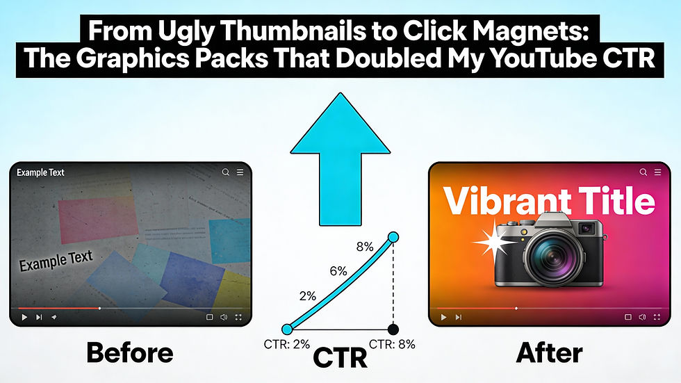
How the “before vs after” thumbnail style changed
Here is how the style shifted after using graphics packs:
Before: random screenshots, tiny text, low contrast colors, no clear focal point.
After: simplified backgrounds, 1–3 words in big, bold fonts, bright accents, and a strong focal point (face, object, or number).
The graphics packs made it easy to reuse certain winning elements: the same fonts, similar color schemes, and consistent positioning of faces and text. Over time, viewers started to recognize the style in their feed, which quietly builds trust and familiarity.
The types of graphics packs that made the biggest difference
Not all packs are created equal. The ones that actually helped increase CTR had a few things in common:
Designed specifically for YouTube thumbnails (not generic social posts)
Tested color combinations that popped against YouTube’s dark and light modes
Layered source files, so elements could be moved, removed, or recolored
Multiple layout variations for close‑up shots, list videos, tutorials, and reaction content
Packs that looked fancy but were hard to edit or came as flat, non‑editable files turned out to be more trouble than they were worth. The best ones were simple, modular, and easy to tweak in common design tools.
What happened to CTR after switching thumbnails
After a few weeks of consistently using the new graphics stack, analytics told a clear story:
New videos launched with higher CTR from day one compared to older uploads in the same niche.
Updated thumbnails on older “evergreen” videos started to get more clicks from suggested and browse features.
Some videos that used to underperform quietly started picking up views as their CTR improved.
The increase was not magic or uniform, but in many cases, CTR almost doubled compared to the old, messy thumbnails. Small changes stacked up: better contrast, stronger hooks, and more professional visuals.
Practical tips for readers ready to upgrade their thumbnails
To help readers turn this case study into action, encourage them to:
Audit their existing thumbnails and identify which ones actually get good CTR today.
Choose graphics packs that match their niche and editing tool of choice.
Create a few reusable thumbnail “templates” inside their editor so they can move quickly.
Test new thumbnails on old videos that still get impressions but have weak CTR.
The core message is simple: better thumbnails are one of the highest‑leverage upgrades a YouTube creator can make. Going from random, homemade graphics to purpose‑built thumbnail packs turned ugly rectangles into true click magnets – and for this channel, that change finally unlocked the CTR the content deserved.
Comments